

We’ve been poking around Nintendo’s official pages and, according to Nintendo Life, there’s an update to the classic Super Mario branding that you might not spot at first glance: the series logo has reportedly been given a subtle 3D makeover, and a set of more detailed character renders may have been uploaded alongside it.
What Was Reported
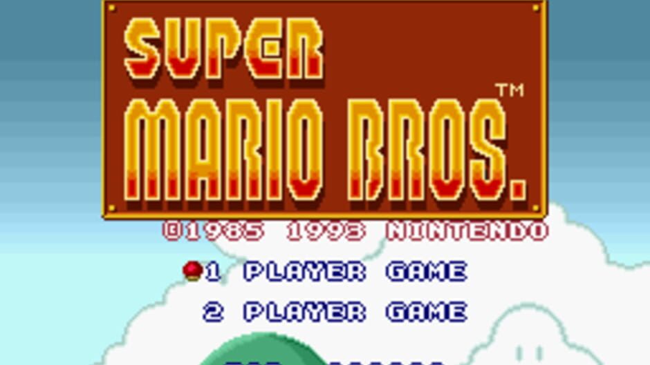
Nintendo Life reports the new look can be seen on Nintendo’s official Super Mario webpage, with the change described as a 3D update to the logo rather than a wholesale redesign. The update is said to be subtle — you might only notice it if you compare the current mark side-by-side with older versions.
Alongside the refreshed logo, Nintendo Life notes that Nintendo appears to have shared new, more detailed renders of Mario on its site. A social-media post documenting the evolution of the franchise’s logo was highlighted via a post credited to Master0fHyrule, and community contributions flagged additional image assets and transparency files hosted on Nintendo’s servers.
Per Nintendo Life, Nintendo also recently published a message on its Japanese website thanking fans for joining in on Mario’s 40th anniversary celebration. During that anniversary period, Nintendo released a raft of Mario-related items including the Super Mario Galaxy Movie, Super Mario Galaxy 1 + 2, new amiibo, Mario Tennis Fever, DLC for Super Mario Bros. Wonder and Yoshi and the Mysterious Book, and the addition of Super Mario Sunshine to the 'Nintendo Classics' GameCube library.
Community members have been busy digging into the assets. One commenter, credited as Didz in the source, posted multiple lossless image links pointing to Nintendo’s asset URLs and observed that some character renders — including Luigi — look like they may have been updated as well.
The Source & Credibility
Our initial find is anchored by Nintendo Life’s reporting, which in turn cites a discovery on Nintendo’s official pages and notes a credit to Nintendo Everything for identifying the new logo on the site. The visual history of past logos was traced back via a social post by Master0fHyrule, and community-sourced asset links were shared in the comments by a user named Didz.
Take this with a pinch of salt: the change is reported rather than officially announced as a brand overhaul. The claim that the logo has been given a 3D treatment is visible on Nintendo’s pages if you follow the links noted by community sleuths, but there’s no formal Nintendo press statement in the material cited by Nintendo Life.
If you want to inspect the raw evidence for yourself, community contributors have posted a number of direct asset paths and lossless images that they say originate from Nintendo’s servers — that communal digging is what brought this to light publicly.
What It Could Mean

Allegedly refreshing the Super Mario logo and updating character renders could be purely cosmetic, a small brand tidy-up after the 40th anniversary activities. If true, it might simply be Nintendo aligning promotional art with newer, higher-resolution marketing assets across web pages and store fronts.
That said, a modest logo tweak can ripple into merchandising and promotional design. Community discussion already includes concerns about how a longer, single-line logo will fit on merchandise and packaging — a legitimate gripe if Nintendo plans to roll the variant out across physical goods. It’s also worth noting that licensed product lines have been a big part of Mario’s commercial presence; changes to the logo could affect how partners adapt their branding (see ongoing developments in LEGO Super Mario items for how toy lines respond to visual updates).
Fans are also eager to connect visual changes to new content. The site’s roundup of recent anniversary releases shows Nintendo has been busy with multiple Mario projects, and that flurry of activity is the backdrop to this logo update. For readers following console and franchise news this year, you might remember similar high-profile anniversary coverage — see our piece on Zelda 40th Switch 2 for how platform-level anniversaries can drive branding and product moves across Nintendo.
Why This Matters
Branding tweaks may seem minor, but for a franchise as iconic as Super Mario, even subtle shifts invite scrutiny. If Nintendo quietly switches to a 3D logo and refreshed character art across


